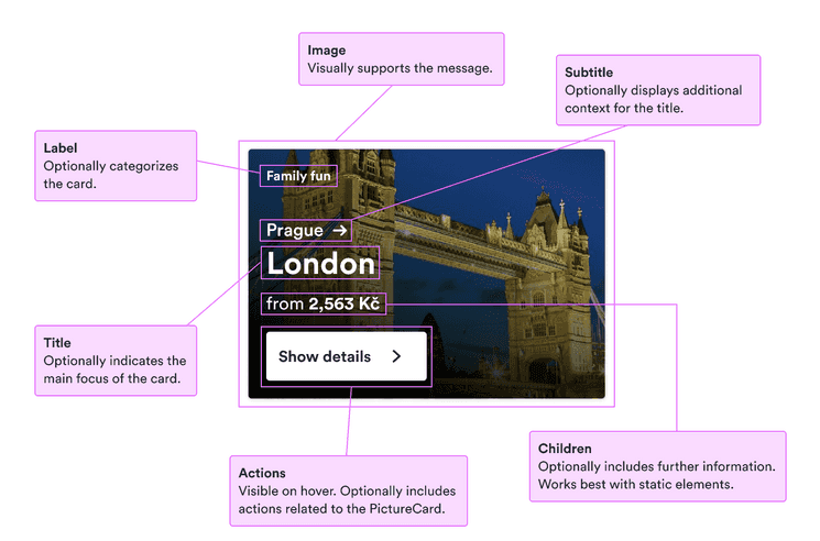
PictureCard
Displays a card with a picture and space for information and actions.
When to use
- To engage users with visuals and some details.
- To provide just enough information to be useful without overwhelming the visual.
- To offer actions associated with the visuals.
When not to use
- For only simple visual context—use an illustration.
- For card without pictures—use a card.
Component status
Figma | React | iOS | Android |
|---|---|---|---|
Designing | Developing | N/A | N/A |
Content structure

Behavior
Make actions clear
Users may see the interesting pictures and think they’re just decoration. If this is part of the main flow, make it clear what their next step should be.
Use cues other than just visuals to indicate why they might want to interact and what they can expect.
Content
Limit information
Picture cards draw attention to themselves with interesting visuals. Don’t overwhelm users by trying to cram lots of information into a small space.
Present only the most important ideas with the chance to see more with an interaction.
Present info nonvisually
Make sure everything necessary is presented to people who don’t see the picture.
If you’re using the picture card as just an image, include alternative text. If the card has content, consider whether the alt text is necessary (if it repeats the title or something similar).
If the card is only for decoration, leave the alternative text blank. Providing text just gives users extra information that doesn’t help them.
Look & feel
Use inverted colors
Picture cards have complicated backgrounds that draw attention. That’s why they darken on hover/focus—to increase the contrast with their text.
If you’re adding your own content such as badges, make sure to use the inverted variants so they stand out against the dark background.